Project Overview:
Redesign proposal for the MTA App, which provides real-time information about the New York City subway, bus, and ferry system, including train schedules, service alerts, and planned service changes.
Role:
I created a design system in Figma for a New York-based transportation and navigation app that ensured consistency and usability across all screens and features. This system includes a color palette, typography, icons, buttons, forms, navigation, and layout. In the discovery phase, I drew inspiration from The a11y Project and focussed on accessibility as a primary goal. Then iterated on the user interface to ensure consistency and usability across all screens and features.
Challenge:
To create an intuitive and user-friendly mobile application for the MTA, a design system should be developed that provides a cohesive and recognizable look and feel throughout the app. The design system should include a color palette that reflects the MTA brand, typography that is legible and easy to read on a small screen, icons that are intuitive and easy to understand, buttons that communicate the appropriate action, forms that are easy to fill out with clear labels and instructions, navigation that is easy to use and intuitive, a layout that is consistent throughout the app with clear hierarchy and spacing, and accessibility standards that ensure the design system is accessible to all users.
Goal:
The goal of this project is to redesign and enhance the MTA app to provide a seamless and user-friendly experience for commuters and tourists navigating the New York City transit system. The primary objective is to create an intuitive, efficient, and visually engaging app that delivers real-time information, reliable navigation, and personalized features. By improving the app's usability, functionality, and aesthetic appeal, the goal is to empower users to plan their trips, navigate the subway system, and explore the city with ease and confidence, ultimately enhancing their overall satisfaction and experience.


Ideation and Design:
To create a familiar and intuitive interface, I drew inspiration from real-world signage, wayfinding, and navigation design in the city. I honored the existing visual language of New York and incorporated its typography, colors, and visual language into the design. I also adhered to best practices in navigation and wayfinding design from other systems utilized at airports and hospitals.

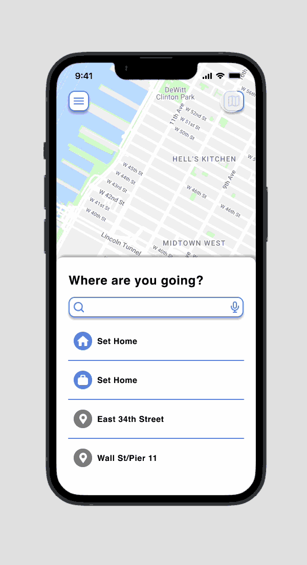
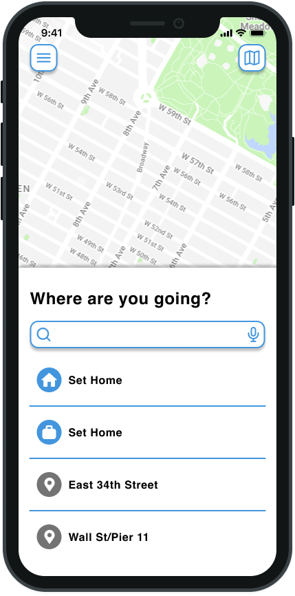
Low-Fidelity Mockup:
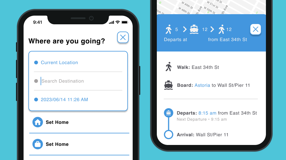
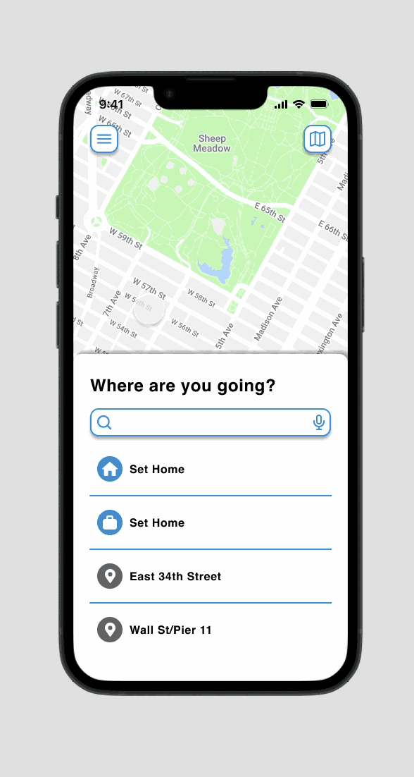
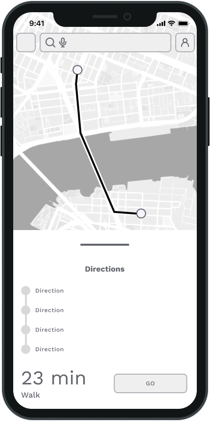
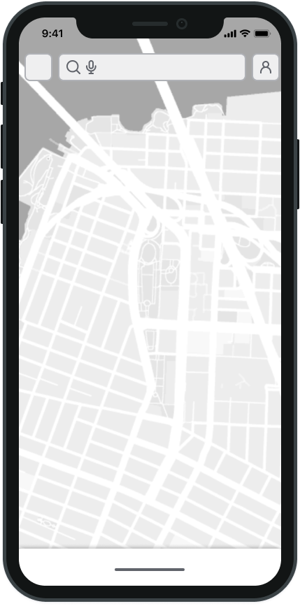
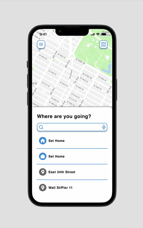
The wireframes for the redesigned MTA app are a visual representation of the app's structure, content, and functionality. They provide a blueprint for the app's design and serve as a guide for developers, ensuring that the final product meets the needs of users and delivers a seamless user experience.

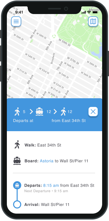
User Flow:
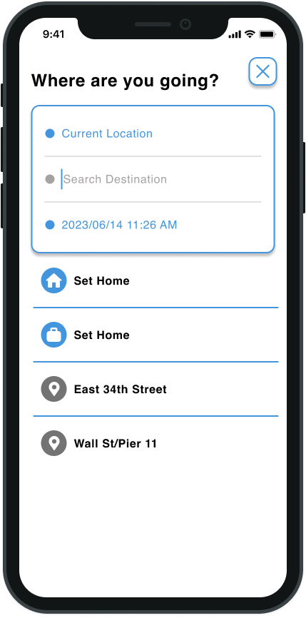
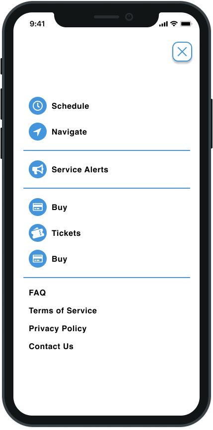
Throughout the user flow, intuitive navigation, accessibility features, and clear visual cues ensure a seamless and user-friendly experience for commuters as they navigate New York City's complex transportation system.

High-Fidelity Mockup and Prototyping:
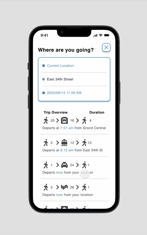
The high-fidelity mockups featured a clean and visually engaging design that adhered to the project's existing design system, incorporating consistent typography, colors, and iconography. Through interactive prototyping, we validated the app's flow, ensuring smooth and straightforward navigation while maintaining a focus on simplicity to enhance the overall user experience.


Improving accessibility:
In this case study, we prioritized accessibility improvements for the app by adhering to WCAG's (Web Content Accessibility Guidelines) accessibility guidelines. We focused on enhancing type and background contrast by systematically identifying contrast ratios, documenting specific contrast values for each text element style, and suggesting alternative color combinations where needed. Additionally, we considered different states and interactions, ensuring contrast compliance across all user interactions, and addressed potential edge cases like text over images or gradients. By integrating these measures into our UI/UX annotations, we successfully improved the app's accessibility, making it more inclusive and user-friendly for all individuals, including those with visual impairments.

Interaction and Component Behaviors:
The redesigned MTA app utilizes interaction animations and component behaviors to enhance the user experience and create a more engaging interface. These animations and behaviors are designed to be subtle and intuitive, guiding the user through the app and providing feedback on their actions in a natural and seamless way.
Conclusion:
By prioritizing accessibility considerations throughout the design process, we have ensured that the app caters to a diverse audience, providing equitable access to information and services for all users, regardless of their abilities. Our commitment to WCAG compliance has not only improved the usability of the app for individuals with disabilities but has also enhanced overall user satisfaction and engagement. Embracing accessibility as a core principle has empowered us to design an app that truly reflects the vibrant and diverse spirit of New York City, where everyone can navigate and explore the city with ease and delight.